

We help Entrepreneurs, like you, Grow..
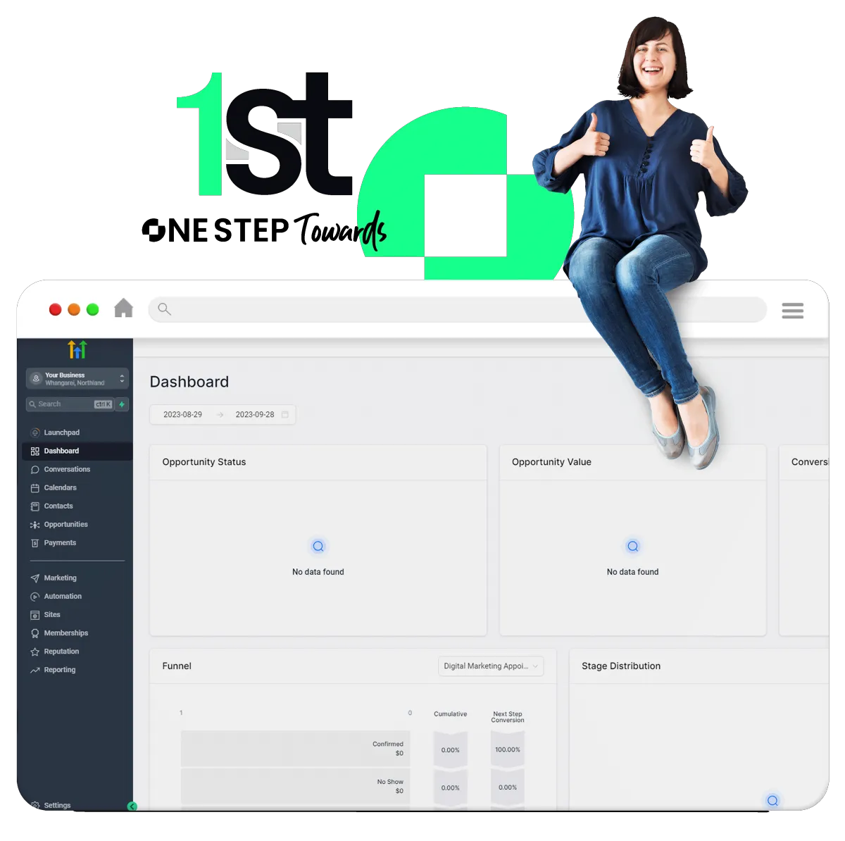
One Step Towards
No longer do you have to cobble together multiple platforms and expensive workarounds. Focus on what you want to achieve, not the steps to achieve it. Break free of mediocre.
Simple Pricing - Retain ownership of your data
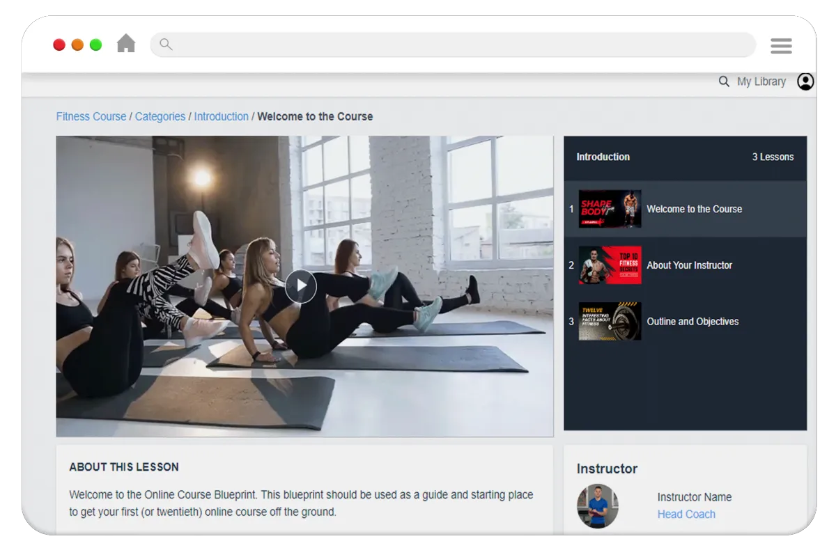
Sell, Manage & Monetise Courses.
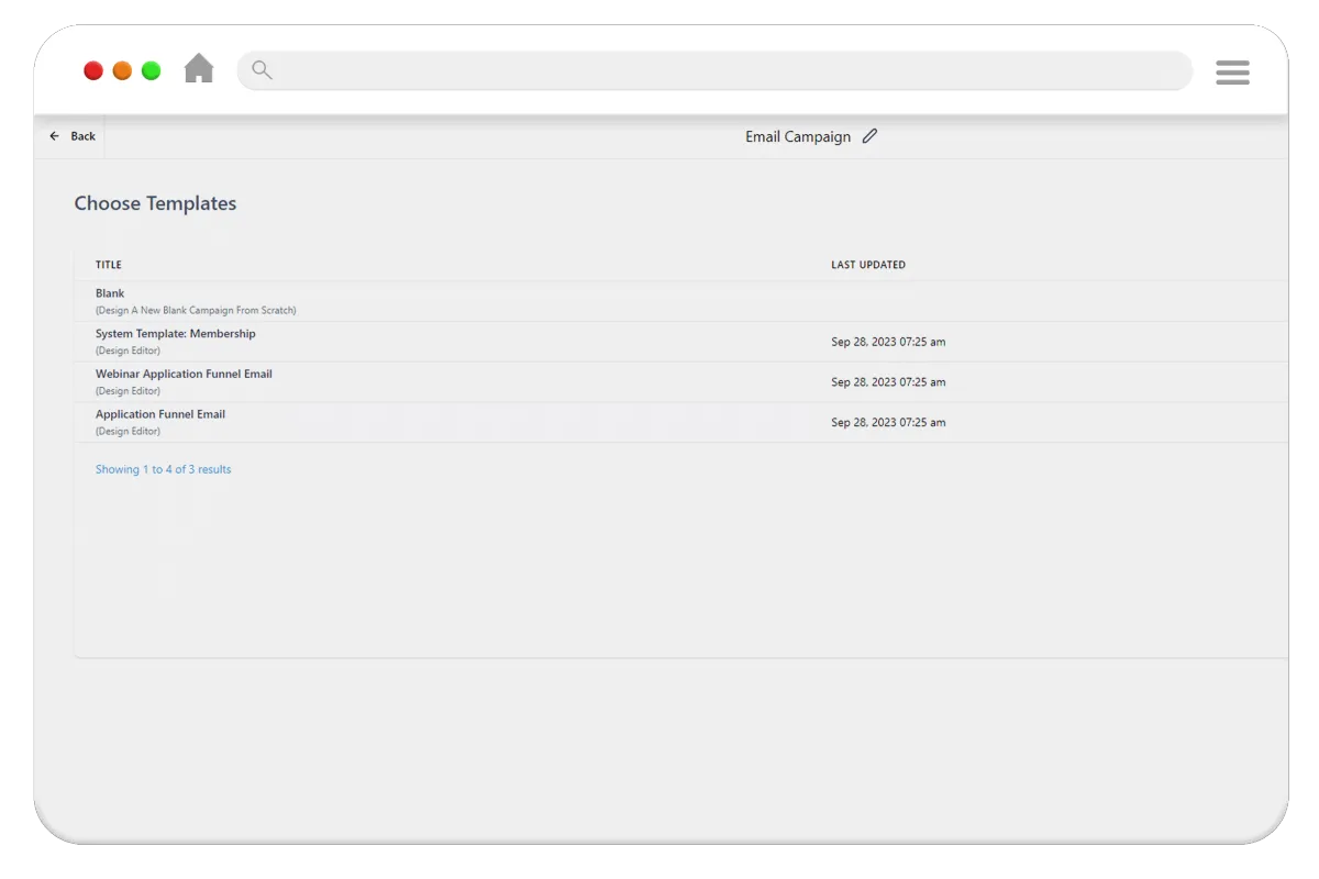
Best practice funnel templates ready to go.
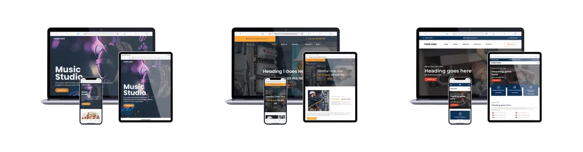
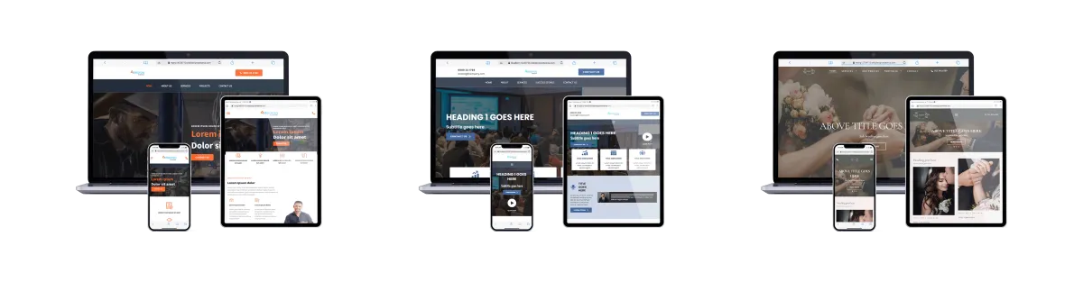
Superb Professional website templates
Suitable for products, services and leads.
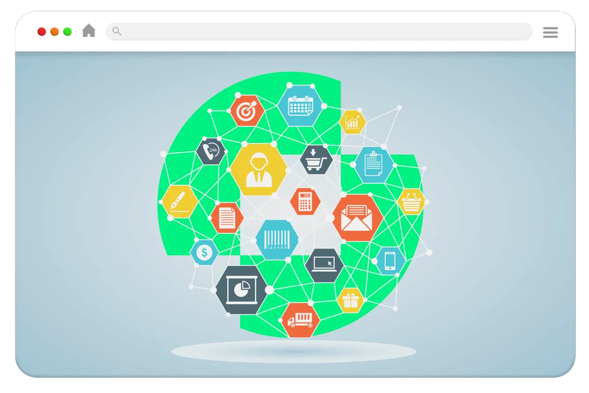
Our Goal Is To Help You Generate More Leads and Sales For Your Courses Products or Services.

Unlimited Funnels
Some platforms limit the number of funnels you can create to drive sales. We Don't.
Unlimited Users
Active Customers and contacts can all become confusing.
We believe in simplicity.
Unlimited Courses
Don't limit your scope to grow. We allow you to offer more to your customers.
Unlimited Possibilities
Manage your Social Media, Reputation, leads and sales. In one place.

Online Marketing is Evolving
Don't Get Left Behind. Thrive.
Your customers expect and deserve more. In this world of ever greater bombardment of ads, customers are left confused as to what you want them to do. Make it simple. Take One Step Towards your Future, Today.
A marketing Hub built into your website...
The cornerstone of your marketing starts with a professional website.
Your website represents your brand. With Pre-made designs to allow you to DIY as well as a DFY solution if you'd prefer, you can be online in as little as a morning.
Easy website editor with version control.
Search friendly & lightning fast loading.
Pre-Built or bespoke website solutions.
DIY - Do It Yourself - DFY - Done For You.
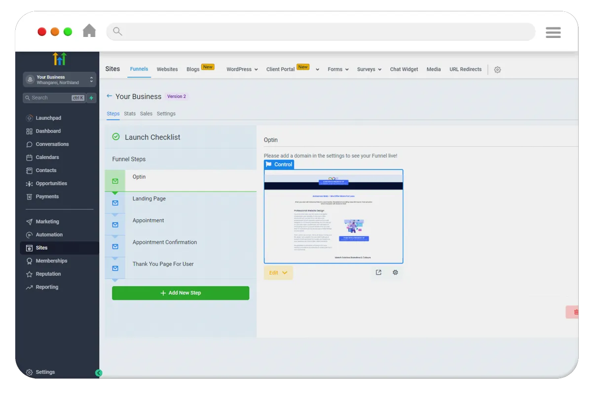
Funnel Customers To Your Business...
Be clear with what you want your customers to do. A Funnel does this.
Funnels increase your sales revenue and allow you to build a relationship with your customers earlier on your terms, not those of social media companies.
Guide customers to take specific actions.
Capture leads earlier in their journey.
Generate more revenue per customer.
We have pre-built leading funnels for you to plug and play.
Build Your Brand With Courses...
Add value with Courses. Share & earn predictable recurring revenue
You are an expert in your field. Courses are not just for teachers and educators (although amazing for these too!). Build relationships with your ideal customers.
Free or Paid courses. (Or mix and match)
Build once. Sell on repeat. Worldwide.
Demonstrate your Knowledge easily.
Courses without a funnel is like capturing water without a bucket.
Email Marketing to Keep Customers Engaged...
Life is all about relationships. Build meaningful connections with Email.
From Email Marketing Newsletters to Email Sequences and Follow Ups, One Step Towards is a complete solution designed to help you build connections.
Guide customers to take specific actions.
Capture leads earlier in their journey.
Generate more revenue per customer.
We have pre-built leading funnels for you to plug and play.
What's Included
One Step Towards is more than just a Website Agency, with some add-on bells and whistles. One Step Towards is a complete Agency designed to help Entrepreneurs like you have all the tools and resources in one platform that works, out of the box. Grow your business seamlessly, not duct-tape multiple half baked solutions together.

Business Insights, Sales & Knowledge all within one place. A single source of truth. How refreshing. Make Analytics easy.
A mobile friendly, dynamic, fast loading website as standard built on Googles framework. A website that's integrated.
Make your customers decision making simple. Lead customers to a solution. Create a greater ROI from paid ads.
Sell your knowledge not your time. Demonstrate your leading industry know-how. Add value to staff inductions.
Own the customer relationship through email marketing. Email sequences designed to generate revenue.
A.I is here to stay. Embrace AI Powered Chat to engage customers as well as AI tools to increase engagement and sales.
Managing all your social media channels, posting consistently and even managing replies. We make it easy.
Send regular newsletters to your clients, fans &subscribers. No need to spend a fortune on additional software, its built in.
Get customers to buy more and tailor your offer based on the actions. Monetise your ad spend faster today.

We are on a mission to drive value.
Why not put us to the test, risk free with a unparalleled trial period

Adam is fantastic at communicating and really goes the extra mile to make sure his clients are happy.
We love our website and thank Adam and his team for all their hard work to date.
A+

Jade Bradley
Fencing Company
Really good experience with Adam Worley @One step Towards. Totally went out of his way and was literally available 24/7. When I was available he would make time from after dark to early mornings. Great experience, very professional and down to earth. Thanks Adam keep up the great work. Cheers, Myles
Myles Foster
IT Support Company
It is wonderful to work with someone where nothing is too much trouble and who puts you at ease no matter how silly your questions maybe – I can tell you he’s very patient too. I highly recommend Adam and his team to anyone wanting a high level of customer service and a quality website.
Louise Payne
Real Estate Agency
Simple Pricing Options - Retain ownership of your data

Are courses for me, how do I start?
Courses demonstrate knowledge —— Businesses can add value through courses. (Paid or Free)
Courses generate ongoing revenue —— Courses can generate revenue when marketed effectively on an ongoing basis. As you are no longer selling your time but your knowledge, it frees you up for more valuable pursuits.


Build a Relationship 24/7
Courses can sign up individuals 24/7 to your world and allow you to demonstrate value and trust, increasing your long term value to clients.
Done Once. Deliver Always
Once you create a course, you can stop selling your time. Free up your time for what really matters. Work smarter not harder.
Create a 'Sticky' Environment
(The good sticky) - Clients and customers stay longer, have increased trust and deliver better results all thanks to your course.
Internal & External Courses
Often overlooked internal staff can also have training delivered through an online portal, ensuring your team are empowered.
No Contracts • Cancel Anytime
What is a Funnel, and should I care?
A Funnel has one purpose —— to drive customers to an action. Sign Up, Purchase, Subscribe or Engage.
A Funnel creates opportunities —— A funnel isn't a landing page - it goes further in taking your ideal customer through a stepped process, (including emails or multi purchase steps) allowing you to earn more money from every transaction.
Ready to Go - Out of the 'Box'
There's a funnel for that. We've pre-built best practice funnels. Focus instead of running your business. Leave the Funnels on auto-pilot.
Ensure a Positive ROI on Ads
Increase your transaction value through add-on orders or email sequences designed to convert leads into sales.
Funnel Customers To You
Don't drive all possible customers to one page. Every ideal customer can have their own Funnel, talking to their inner most fears.
Make Purchasing Simple
Clear the clutter and don't let your customers get side tracked by lots of places to click.
Simple Pricing Options - Retain ownership of your data
Allow Our TEAM to build your online presence
Want Us To Do The Tech? - Try Our 'For You' Service
We understand that building a business is more than the technology you use. If you want to focus on what really matters, why not have our team focus on the website, the funnels or even the copy and marketing emails and sequences. We can do as little aor as much as you require.
Better yet, when you use our website or funnel design services, we back our work 100%. If you aren't entirely happy you can keep the webiste (or funnel) and not pay a dime. That is our guarantee to you. So focus on that course you want to create or business offer. We have the technology covered.


Take control of your marketing with One Step Towards
Built for modern day marketing One Step Towards helps entrepreneurs like you grow. Giving you all the tools you need to elevate your marketing, so you can get on with what matters most. Running your business.
Our platform helps you create a greater connection and trust with your clients, whilst making marketing easier, and in turn increasing sales.
Some say data is the new oil. We believe it is trust.
Adam Worley
Founder/CEO
Let us partner with you to grow your business.
Frequently Asked Questions
Are there any long term tie-ins?
We want to partner with businesses that have a passion for growth. We understand that businesses change and requirements change. Whilst we believe we are the best all in one platform with unparalleled support to help businesses grow, we don't agree with long term tie-ins. Choose between month to month or save big by joining for twelve months.
What about updates and hosting?
The great thing about our service is that it is all based in the cloud (on Google) and so you don't need to worry about hosting or updates. Everything is updated and ready for you. Best of all, new features and updates get added regularly, so you can keep focused on what you do best - running your business.
Who owns my data? What about my content and subscribers?
You do! It really is that simple. Your users, your content and your subscribers are yours. In fact ANY of the content you create is yours. We don't have permission to contact your users for any reason. We are a platform that allows you to deliver your marketing message to the world.
What happens if I cancel our subscription to One Step Towards?
We work in the same way as your Nextflix subscription. If you choose to cancel your subscription to our software, you lose access. So if you do decide to leave us, please ensure you save and download a copy of your content.
Are there limitations on the plans you offer?
The pricing page clearly outlines what is available on the differing plans. We believe we are the most competitively priced service for the comparable service offered.
I have further questions, how do I get in touch?
We understand choosing a new marketing company and platform (even one that includes websites, funnels, follow-ups, newsletters, AI and so much more) can be daunting. But if you have any questions, just drop us an email via one of our contact forms (there are many across the website) and one of the team will get back to you.
Start learning today!
Here at One Step Towards, we also offer a variety of training and marketing courses to help Entrepreneurs Like You Grow. These are not courses selling you on our solution, but practical marketing insights and step by step support to help you regardless of the platform that you use.
• For Your Entrepreneurship Journey •
You've reached the bottom of the page...
If you are still reading, congrats. We have nothing else to share with you. If you have any further questions that get in touch. But we would recommend reaching out and seeing for yourself how our marketing tools can help you grow your business. We utilise the leading platforms. After all, you are a leader in your field. You are an Entrepreneur. You embrace the opportunities presented.

One Step Towards goal is simple. To help entrepreneurs like your grow. Technology shouldn't limit your possibilities. With no hidden surprises, just lots of extras as standard, we are the marketing solution that goes further than the leading well-known competition.
Because we work harder for you.
For the purposes of legal doubt: All wording provided on this page is for information purposes only. Any monetary amounts indicated are hypothetical and not revenue claims or indications of earnings. All stories are entirely fictitious and do not represent individuals, or businesses past or present.
1768Degrees Limited ©2023 - All Rights Reserved